Pitcher List

Role

UI Lead

Visual Designer

Responsibilities

I led the visual redesign and layout reorganization of the fantasy baseball website to create a cleaner, more modern, and reader-friendly experience. I also designed high-impact player pages that effectively balanced dense statistical data with strong visual hierarchy, making complex player information both easy to scan and visually engaging.

Graphics

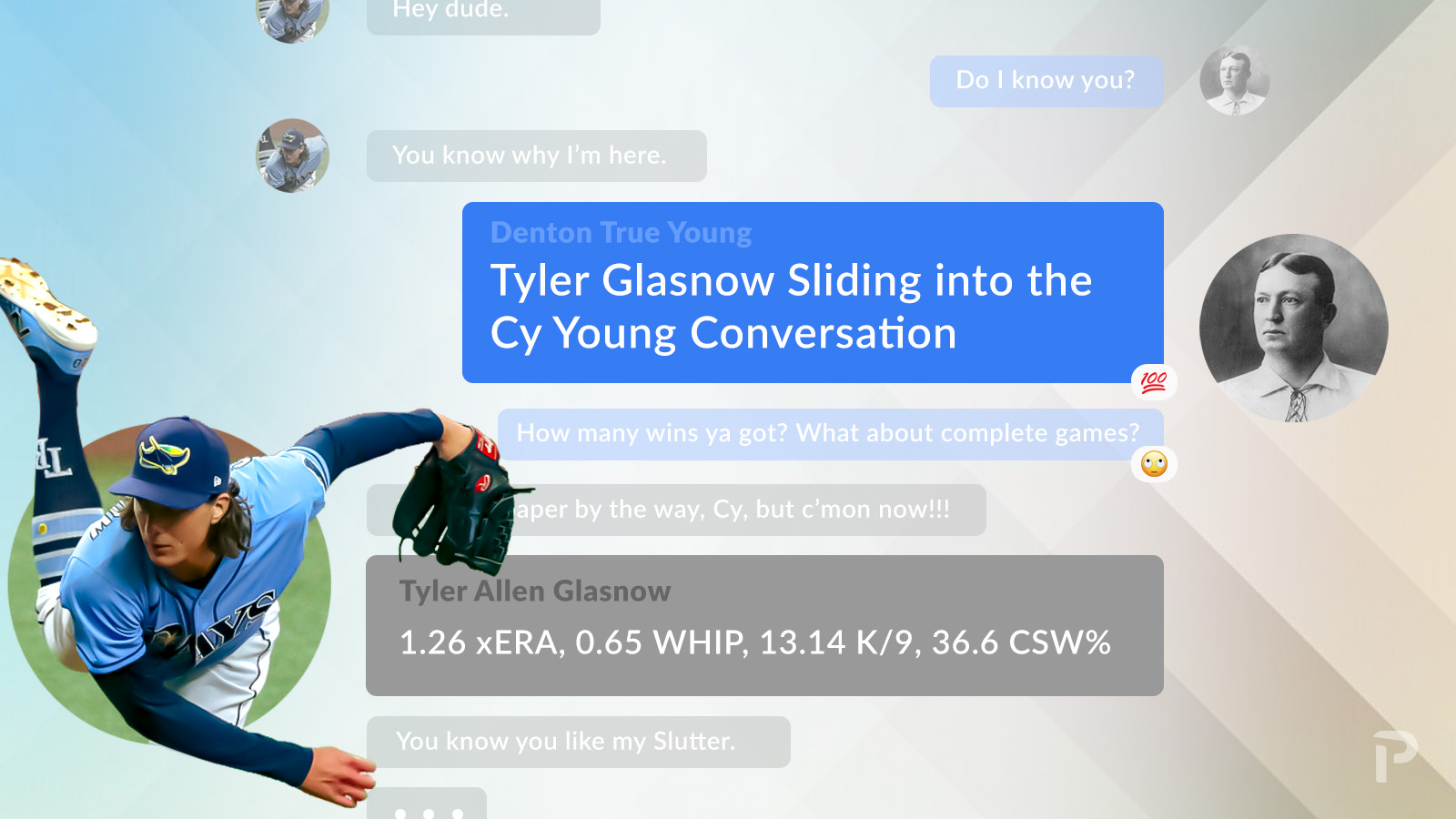
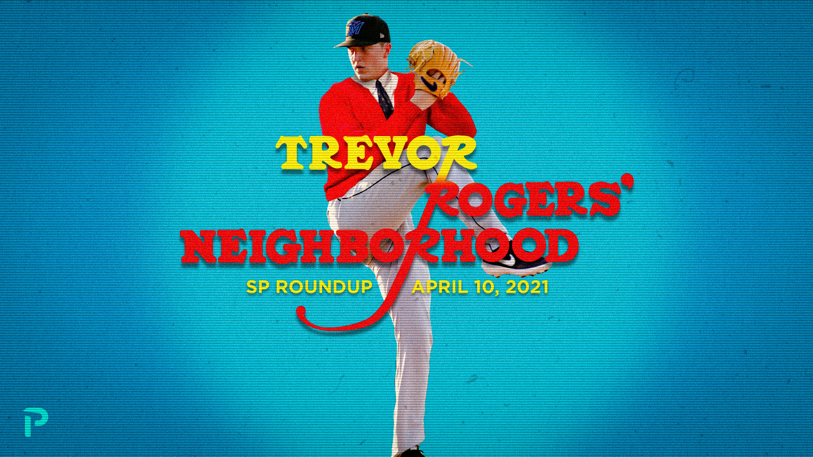
When I first joined PL, one of my earliest responsibilities was creating hero images for over 150 articles across the site. Many assignments came with extremely tight deadlines — often just a couple of hours — requiring fast, high-quality execution under pressure. While most projects granted significant creative freedom, the SP Roundup series demanded graphics that cleverly tied into the pun-inspired article titles. All of these visuals were produced entirely by hand in Photoshop, well before generative AI tools became widely available.

Pitcherlist Website

The original PL website felt dated, fragmented, and failed to reflect the depth and excitement of modern fantasy baseball coverage.

To address these issues, I led a redesign focused on improving wayfinding and optimizing screen real estate. The goal was to create a more robust, unified experience that integrated all of the brand’s media channels while providing quick, prominent access to the site’s most popular articles and columns.

Homepage

Homepage
Above the Fold
Original
Current

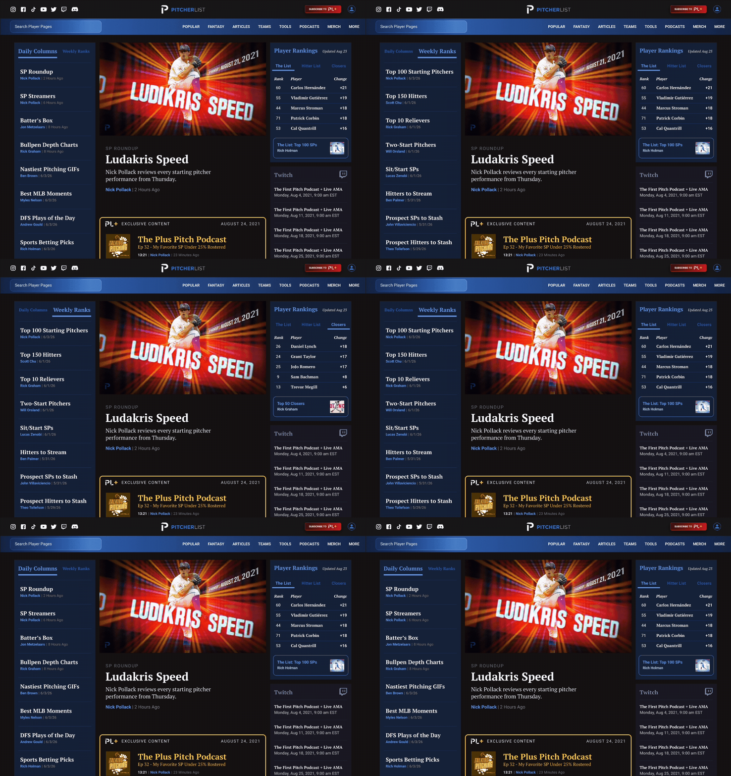
The original homepage featured a single full-screen hero image linking to the featured article. While visually prominent, this design limited content exposure and underutilized screen real estate.

The redesigned version replaces it with a balanced three-column layout that significantly improves density and discoverability. It showcases the most popular articles and columns archive on the left, the featured article with member-only podcasts in the center, and expert rankings/lists on the right, while enhanced navigation surfaces the brand’s social channels.

This creates a much richer, scannable entry point for fantasy baseball readers.

Homepage
Below the Fold

Original

Header

The original design displayed static rows of article categories, showing 4–12 articles per section with links to their archive pages. This created a simple but uninspiring experience that required excessive scrolling and offered poor wayfinding.

Current

Header

The redesigned layout continues the three-column system for better continuity and efficiency. A sticky left navigation lists all article categories, dynamically updating the center column with relevant articles as users select different categories. The right column features a sticky list of recent podcasts.This creates a more interactive, compact, and engaging reading experience with significantly less scrolling and faster access to content.

Player Pages

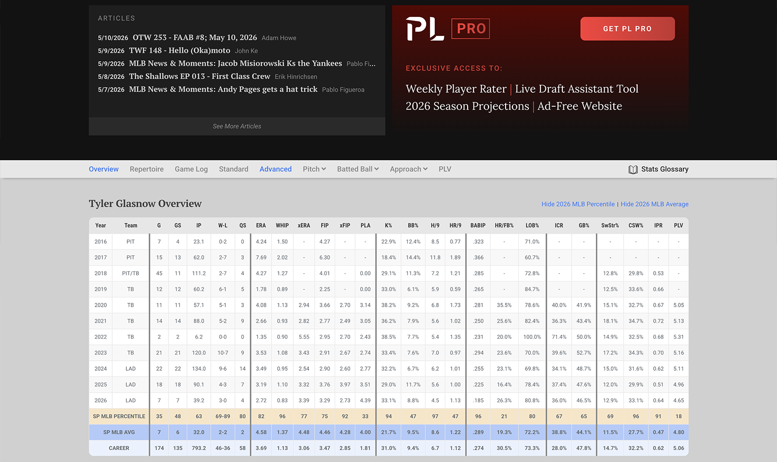
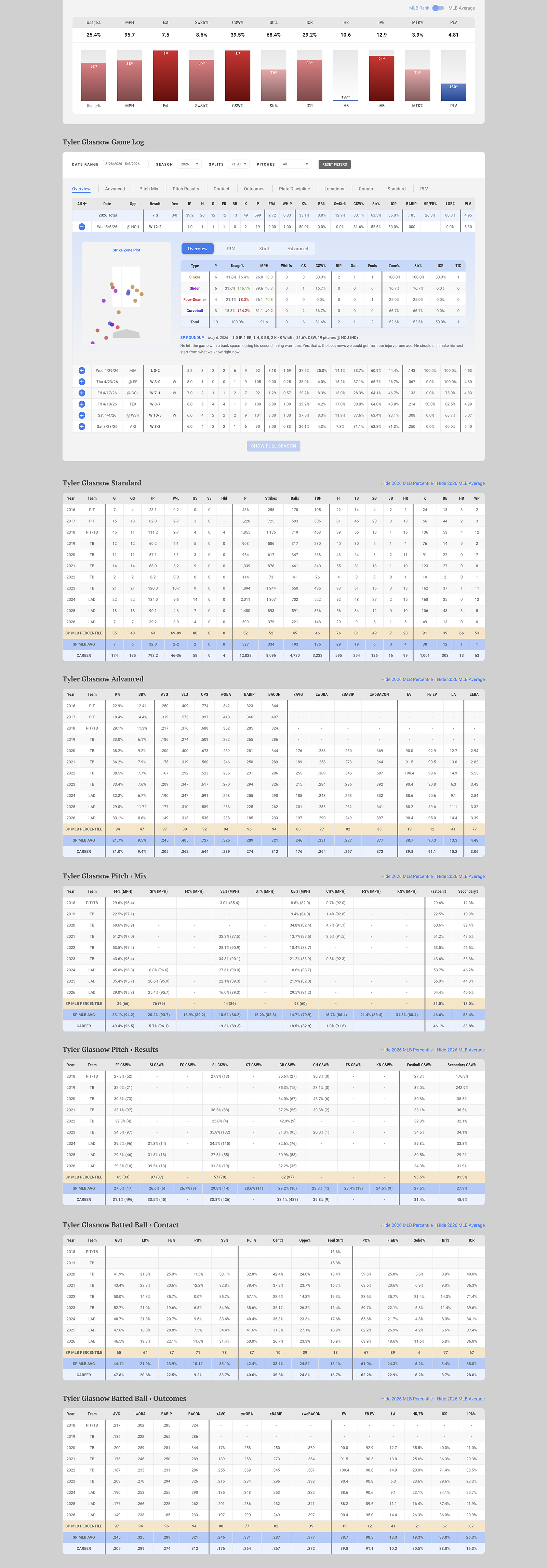
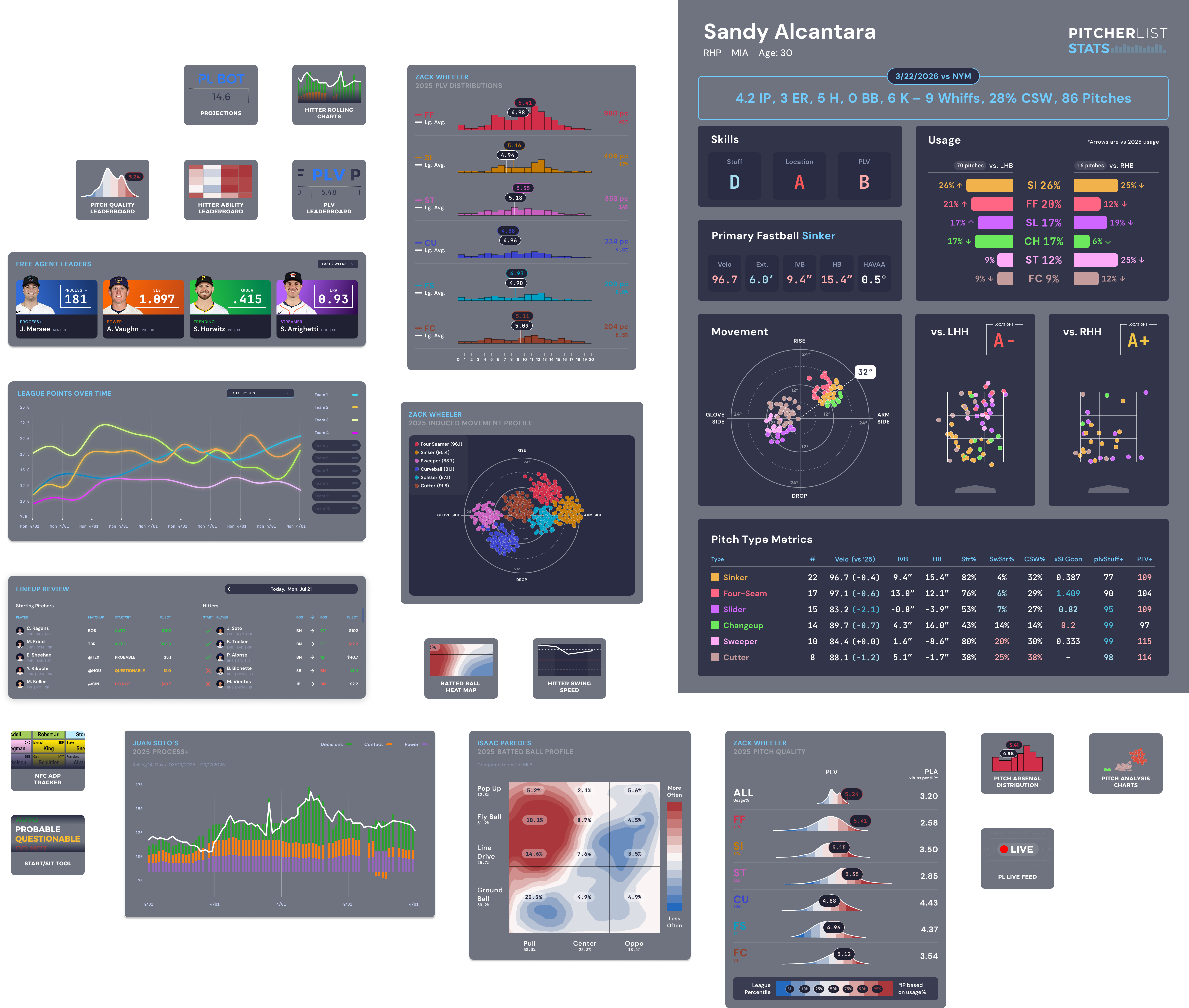
I designed intuitive player pages that turn dense statistical data into a clear, scannable, and actionable experience for fantasy managers. The layout emphasizes strong visual hierarchy and logical information architecture, helping users quickly find advanced statistics to support confident, data-driven decisions.
Key Sections include:
  • Performance Snapshot: A quick, at-a-glance performance overview featuring digestible bar charts that compare the player’s key metrics against league averages.
  • Pitcher Repertoire Analysis: In-depth breakdown highlighting pitch usage, execution, and performance effectiveness.
  • Game-by-Game Analysis: Granular seasonal insights that reveal the ebbs and flows of each individual appearance for deeper performance context.

Player Pages

I designed intuitive player pages that turn dense statistical data into a clear, scannable, and actionable experience for fantasy managers. The layout emphasizes strong visual hierarchy and logical information architecture, helping users quickly find advanced statistics to support confident, data-driven decisions.
The core of the dashboard is a flexible grid of easily digestible cards that act as both summary views and quick navigation entry points.

Pro Dashboard

I designed a comprehensive personalized dashboard that serves as the central hub for managing teams and accessing Pitcherlist’s full suite of advanced tools. The goal was to create an intuitive, glanceable interface where users could quickly navigate between their teams, key stats, projections, and analysis modules without feeling overwhelmed by dense data.