
A&H Design Group

Role

Lead UI/UX

Visual Designer

Responsibilities

As Lead UI/UX Designer, I defined the digital experience for a modern sex toy brand. My work centered on building thoughtful layouts that turned dense product information, educational content, and category browsing into smooth, approachable, and confidence-building user journeys.


B-Vibe Homepage

I redesigned B-Vibe’s website to prioritize accessibility and inclusivity while projecting a playful yet premium feel.
  • Hero section featured bold, tasteful product imagery and an inviting tagline emphasizing pleasure without stigma.
  • Anal Academy: A major dedicated section (accessible from the main nav and homepage) served as the heart of the site. Laid out as a rich, browsable content library with categorized guides, beginner’s pathways, and illustrated articles.
  • Feel: Consistent use of soft playful accents, and responsive breakpoints ensured the site felt open and non-overwhelming. Thoughtful content hierarchy made sex education feel approachable and empowering.
This layout successfully balanced e-commerce functionality with educational depth, creating an inclusive digital space that reflected B-Vibe’s values.

B-Vibe Homepage

I redesigned B-Vibe’s website to prioritize accessibility and inclusivity while projecting a playful yet premium feel.
  • Hero section featured bold, tasteful product imagery and an inviting tagline emphasizing pleasure without stigma.
  • Anal Academy: A major dedicated section (accessible from the main nav and homepage) served as the heart of the site. Laid out as a rich, browsable content library with categorized guides, beginner’s pathways, and illustrated articles.
  • Feel: Consistent use of soft playful accents, and responsive breakpoints ensured the site felt open and non-overwhelming. Thoughtful content hierarchy made sex education feel approachable and empowering.
This layout successfully balanced e-commerce functionality with educational depth, creating an inclusive digital space that reflected B-Vibe’s values.

Themes & Campaigns

To maintain freshness and drive ongoing engagement, I implemented a flexible theming system that supported a new promotional or product-focused theme every 4–6 weeks.
Each theme was designed as a modular layer that integrated seamlessly into the existing layout and information architecture. Key features included:
  • Quick customization of hero banners, color accents, promotional modules, and visuals
  • Full preservation of core navigation, education hub, product grids, and overall user experience
  • Consistent brand voice — maintaining the playful, inclusive, and inviting tone for gay and straight men and women

Themes & Campaigns

To maintain freshness and drive ongoing engagement, I implemented a flexible theming system that supported a new promotional or product-focused theme every 4–6 weeks.
Each theme was designed as a modular layer that integrated seamlessly into the existing layout and information architecture. Key features included:
  • Quick customization of hero banners, color accents, promotional modules, and visuals
  • Full preservation of core navigation, education hub, product grids, and overall user experience
  • Consistent brand voice — maintaining the playful, inclusive, and inviting tone for gay and straight men and women

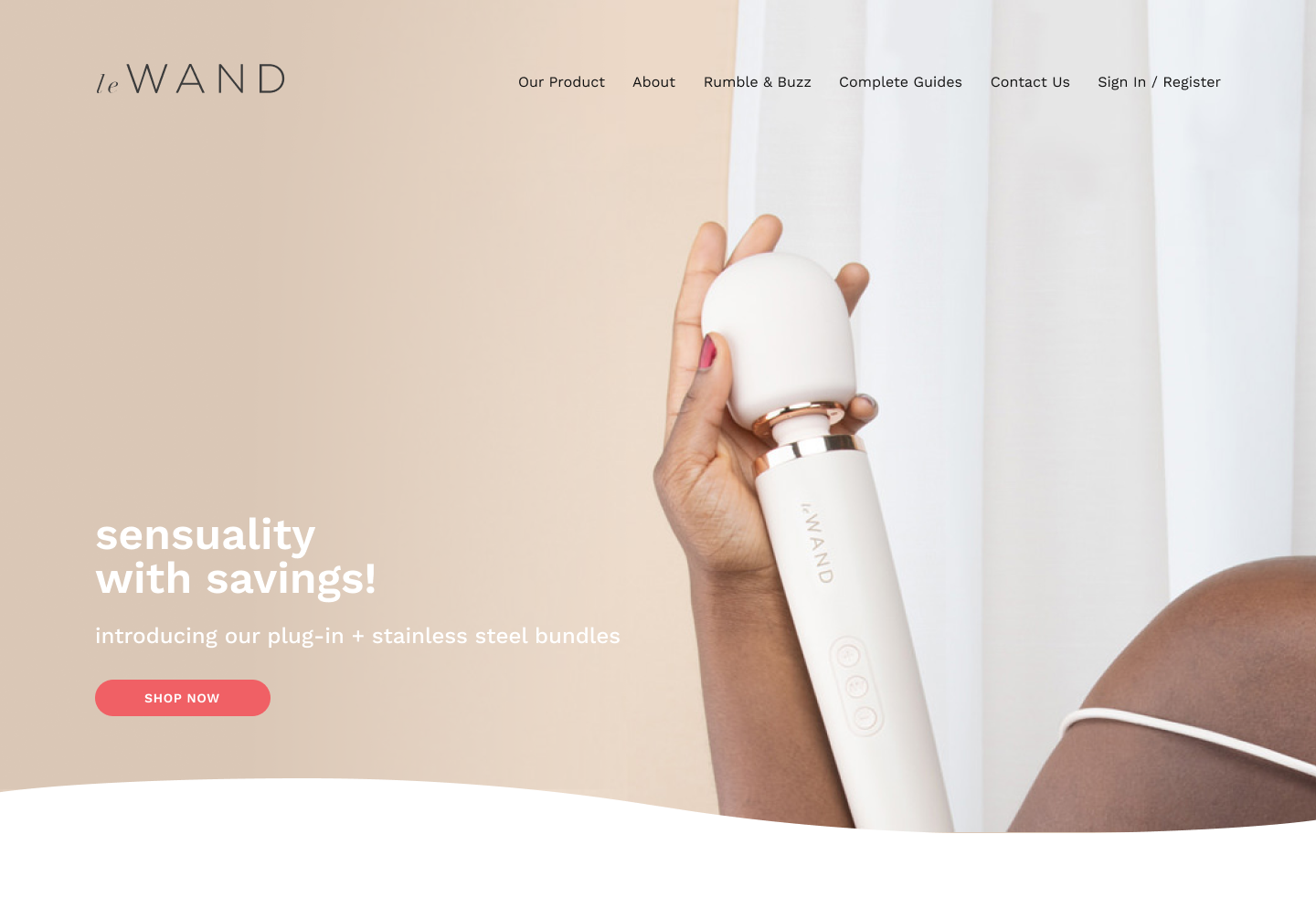
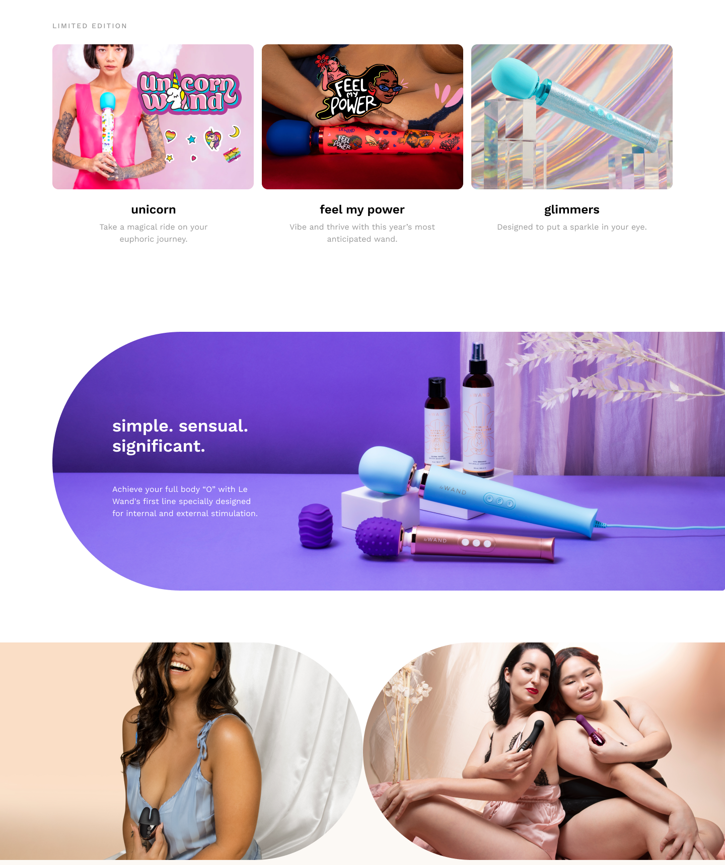
LeWand Homepage

Building on the same principles of inclusivity and education as B-Vibe, the new site adopted a distinctly feminine, sophisticated aesthetic — refined, empowering, and inviting rather than playful.
  • Elegant, feminine visual language with soft palettes, refined typography, and tasteful product photography
  • Intuitive information architecture that prioritizes accessibility and inclusivity across diverse audiences
  • Seamless integration of educational resources alongside streamlined shopping flows

LeWand Homepage

Building on the same principles of inclusivity and education as B-Vibe, the new site adopted a distinctly feminine, sophisticated aesthetic — refined, empowering, and inviting rather than playful.
  • Elegant, feminine visual language with soft palettes, refined typography, and tasteful product photography
  • Intuitive information architecture that prioritizes accessibility and inclusivity across diverse audiences
  • Seamless integration of educational resources alongside streamlined shopping flows

Meet the B-Vibe Butt-ies

For Pride Month, I designed and art-directed a vibrant single-page microsite titled “Queer 365 Days a Year – Meet the B-Vibe Butt-ies.” The page celebrated the LGBTQ+ staff members across the company through authentic interviews that included a warm personal introduction, playful questions, and each person’s favorite B-Vibe.
This one-off piece extended the brand’s values of inclusivity and education into a joyful, human-centered celebration that highlighted the real people behind the products. The microsite successfully reinforced the company’s commitment to authentic LGBTQ+ representation and community connection well beyond Pride Month.