Jetsetter Magazine

Role

Design Lead

Web Design

Scope

Content Management Strategy

Web Design

UI Design

Info. Architecture

Branding

the Challenge

The original Jetsetter website lacked the refined luxury experience expected from a premium travel platform. Its flat information architecture and broad categories made content hard to discover.

Results & Impact
  • Organic users grew from ~50/month to over 20,000/month (peaking at 50,000)
  • Click-through rate increased from 1% to 2.5–3%
  • Average on-page time rose from 3 seconds to 1 minute 30 seconds

Problem Statement

The site suffered from inefficient information architecture, poor navigation, inconsistent design, inefficient SEO and an overall dated aesthetic that hindered content discovery and user enjoyment.

Site Architecture

Site Architecture

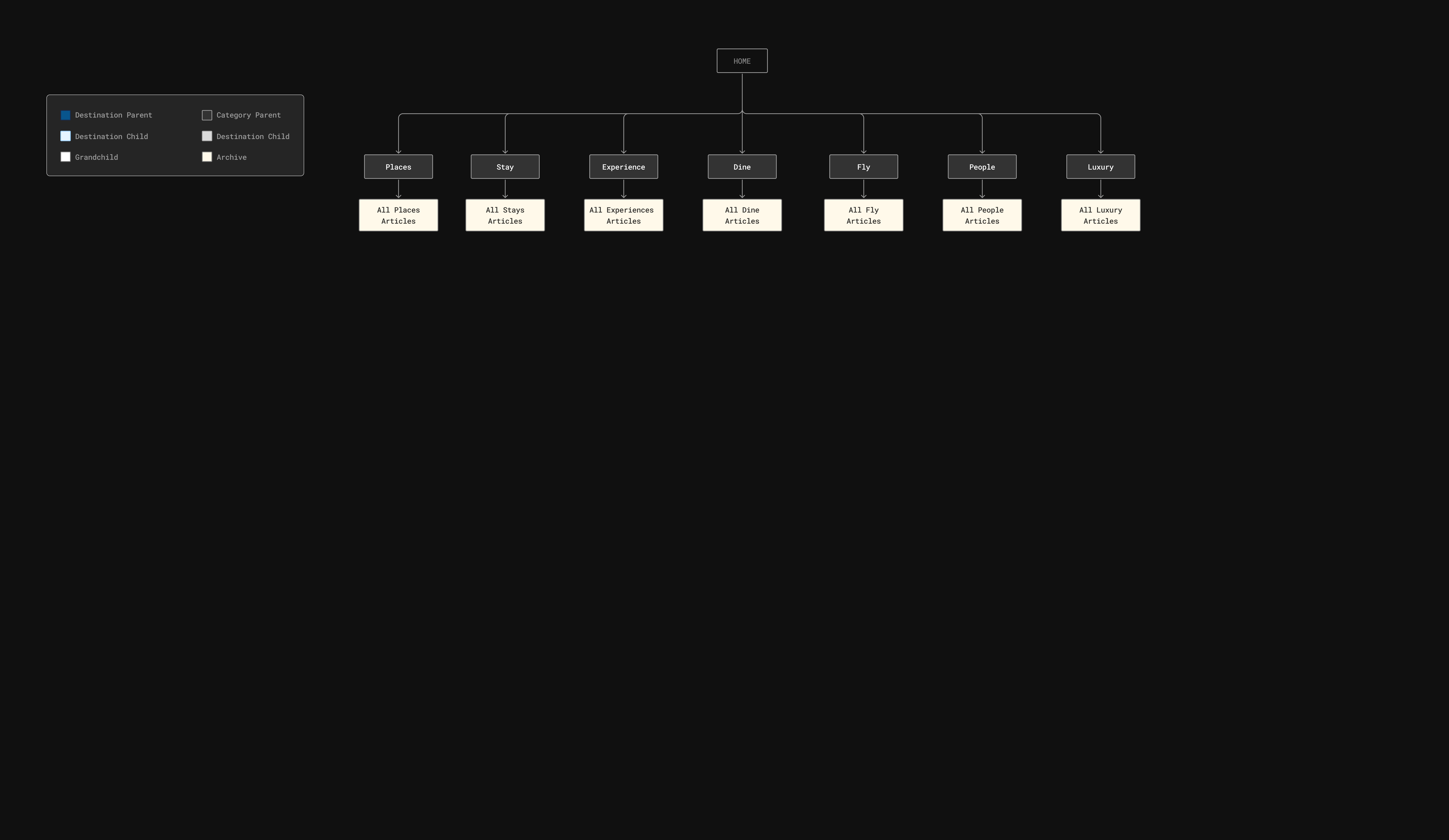
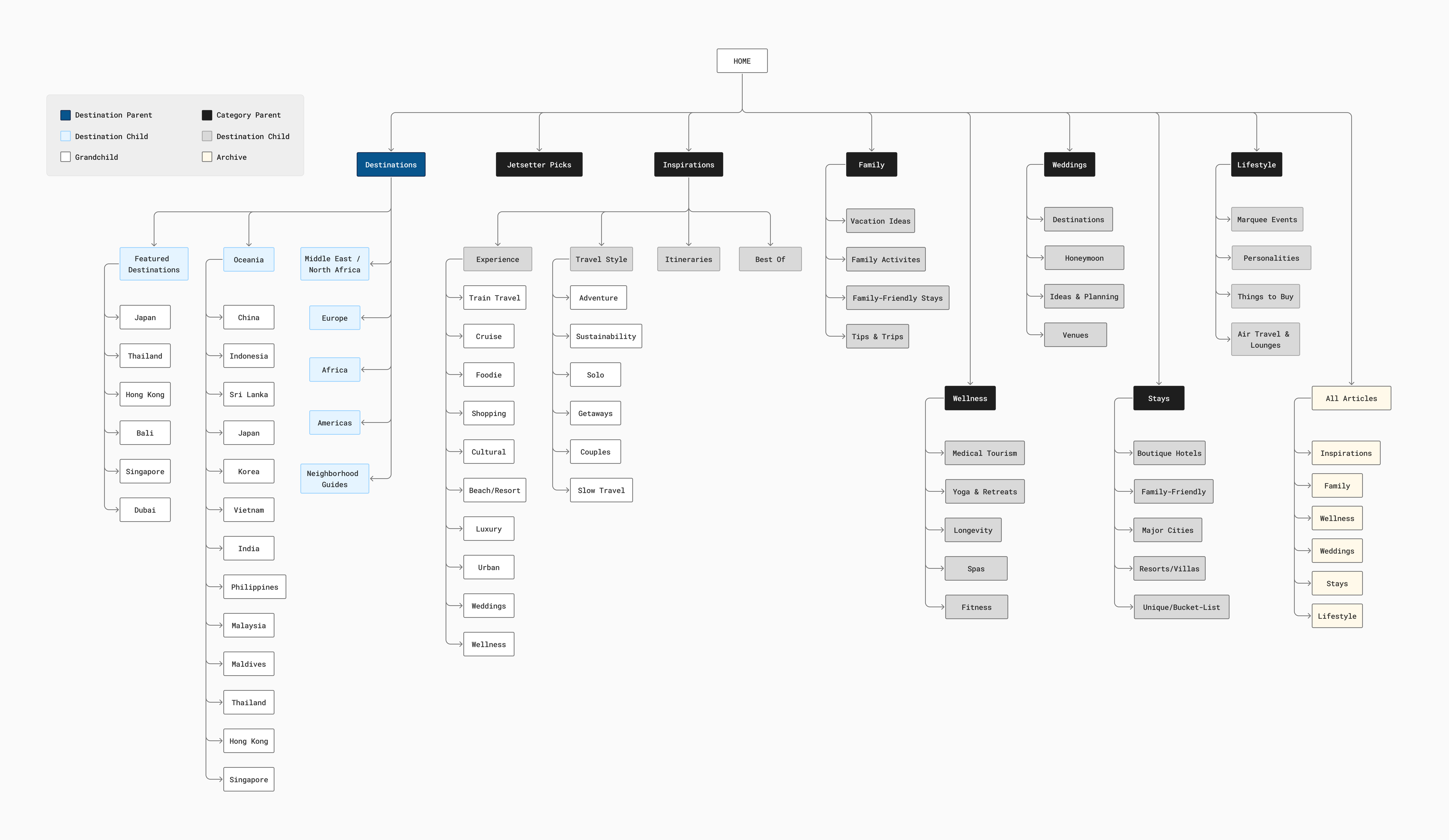
Over 500 articles were crammed into just 7 broad categories with no granular filtering or destination browsing. Restructured into a clear parent-child-grandchild hierarchy with a dedicated Destinations section and megamenus for better wayfinding and scalability.

Original
Current
Layout
Issues

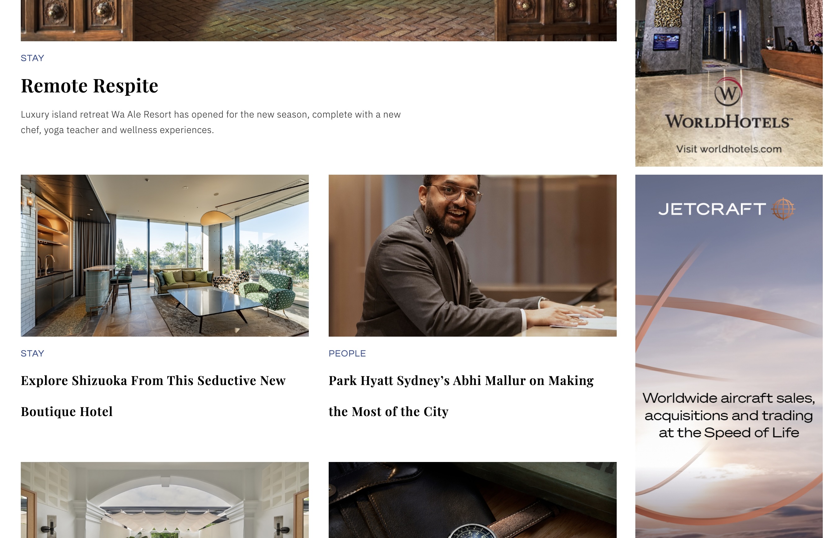
In the original design, inconsistent spacing disrupted clear typographic hierarchy and undermined the elegant aesthetic expected from a premium travel platform. Additionally, unclear text-image relationships combined with an excessive number of visible articles per category created confusion and cluttered the overall reading experience.

Titles not visible

Hero image of homepage displays carousel of featured articles but titles of each article can only be seen below fold.

Alignment

Title line-spacing and category-to-title-to-deck spacing all need to be tightened up.

Scroll Fatigue

Users lose sense of progress or location within the context of the page. Spacing issue contributes to endless confusion as more white space is needed between rows of articles.

Category not clickable

This should be an opportunity for users to explore more of the site.

Layout

In the original design, inconsistent spacing disrupted clear typographic hierarchy and undermined the elegant aesthetic expected from a premium travel platform. Additionally, unclear text-image relationships combined with an excessive number of visible articles per category created confusion and cluttered the overall reading experience.

Titles not visible

Hero image of homepage displays carousel of featured articles but titles of each article can only be seen below fold.

Alignment

Title line-spacing and category-to-title-to-deck spacing all need to be tightened up.

Scroll Fatigue

Users lose sense of progress or location within the context of the page. Spacing issue contributes to endless confusion as more white space is needed between rows of articles.

Category not clickable

This should be an opportunity for users to explore more of the site.

JS 2.0: Revamping Jetsetter Magazine's website

To better fulfill its role as a trusted guide to elevated travel and luxury, Jetsetter underwent a comprehensive redesign. Three core improvements were introduced: a refreshed layout and visual identity, a restructured information architecture, and new search and filtering tools designed to enhance content discovery and reader inspiration.

Layout & Design

The Post Module

At the core of the redesigned Jetsetter experience is the post module — a clean, flexible, and reusable unit composed of an image, category tags, headline, and author credit. Variations exist across the site, yet all maintain a consistent feel through streamlined anatomy and thoughtful whitespace, delivering a smooth and intuitive reading experience across the site.

Mitigating Scroll Fatigue

To reduce visual fatigue in the infinite scroll feed, the article grid strategically employs several of these post module variations. Rather than overwhelming users with too many articles at once, the feed now displays only the most recent stories, with clear links provided to access additional content within each category.

1
2
3
  1. See All Link
    Categories show between 3 to 6 articles. See All link navigates to category archive page.
  2. Tabs
    Tabs are implemented to alleviate excess scrolling and to highlight the popular subcategories.
  3. Carousel
    Autoplay and manual scrolling to view more posts without disrupting the flow of the page layout.

Varying configurations allows for layouts that best fits the message we're trying to portray for each category

Layout & Design

The Post Module

At the core of the redesigned Jetsetter experience is the post module — a clean, flexible, and reusable unit composed of an image, category tags, headline, and author credit. Variations exist across the site, yet all maintain a consistent feel through streamlined anatomy and thoughtful whitespace, delivering a smooth and intuitive reading experience across the site.

2
1
  1. Categories
    Category links link to category or destination page
  2. Author
    Author credit links out to author archive page

Mitigating Scroll Fatigue

To reduce visual fatigue in the infinite scroll feed, the article grid strategically employs several of these post module variations. Rather than overwhelming users with too many articles at once, the feed now displays only the most recent stories, with clear links provided to access additional content within each category.

Varying configurations allows for layouts that best fits the message we're trying to portray for each category

4
5
6
  1. See All Link
    Categories show between 3 to 6 articles. See All link navigates to category archive page.
  2. Tabs
    Tabs are implemented to alleviate excess scrolling and to highlight the popular subcategories.
  3. Carousel
    Autoplay and manual scrolling to view more posts without disrupting the flow of the page layout.
Homepage
Implementation
Content Discovery
Implementation

Eight archival links in the top navigation provide access to Destinations and seven primary categories. Each category functions as a parent page that intelligently branches into relevant child pages, with some sections extending further into grandchild pages. This scalable information architecture, supported by megamenus, creates an organized and intuitive framework for users to explore the full breadth of content while maintaining strong discoverability and orientation across the site.

Megamenu
Archive page anatomy
4
5
6
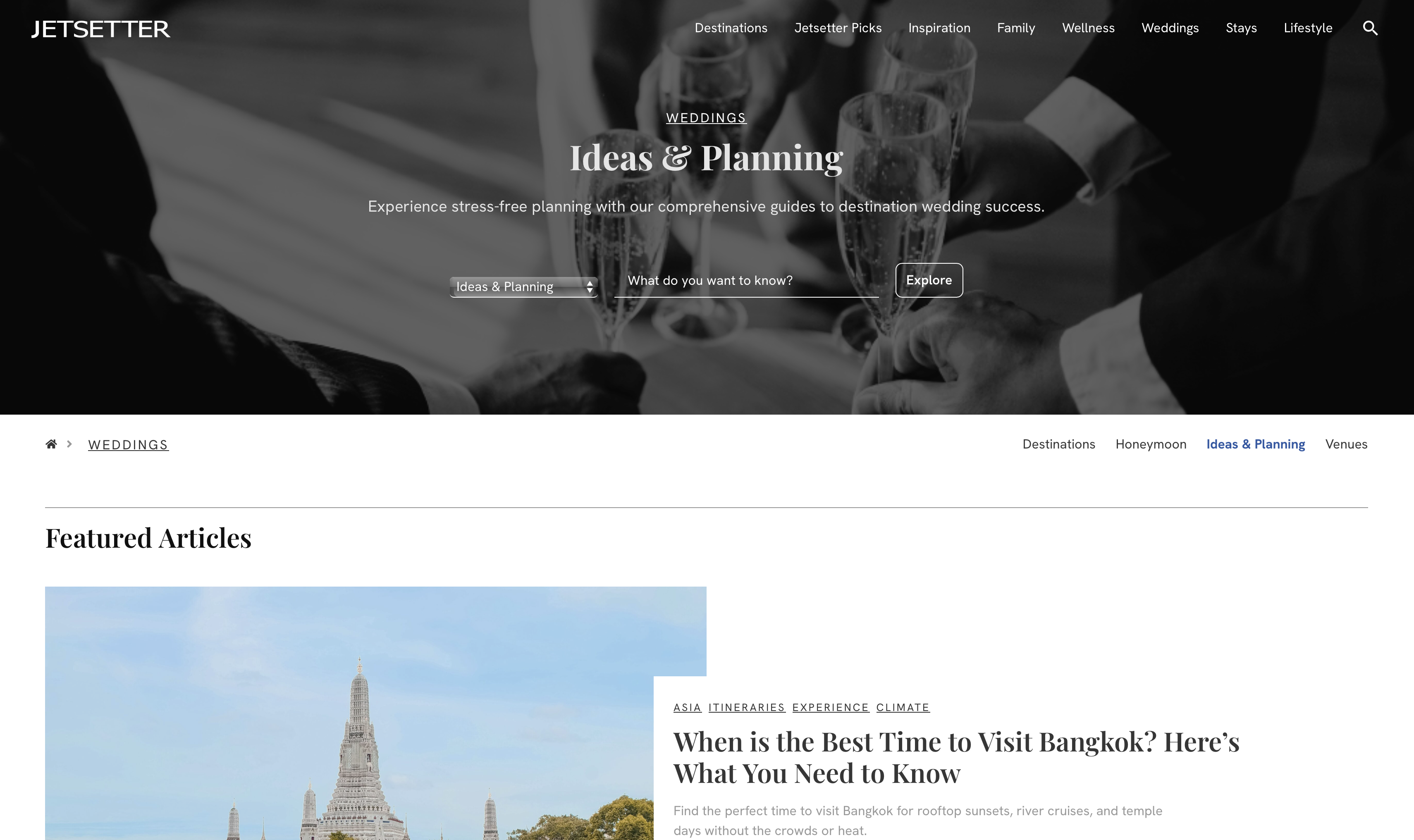
  1. Category Filter
    Immediately search within given category if you know exactly what you're looking for.
  2. Breadcrumb
    Clear location context, easy navigation to parent categories.
  3. Siblings / Children
    Grandchild pages will show sibling categories. Parent pages will show child categories.
Article page
7
8
9
  1. Contents (Left Column)
    Anchor links bring user to section
  2. Summary (Center Column)
    3 bullet points outlining the main ideas of the article
  3. Related (Right Column)
    Posts are selected based on common categories and/or destinations

Outcome

The redesigned architecture and layouts in combination with improved SEO created an intuitive, premium platform that dramatically improved content discoverability and user engagement. It showed how thoughtful information architecture and modular design can drive significant audience growth.