Design Lead
Product Designer
Art Director
Design Strategy
UX Research
UI Design
Design System
Branding
Design an accessible, intuitive cross-platform service that educates space-constrained HK residents on door-to-door valet storage, differentiates from traditional mini-storage, builds trust, and drives conversions.
With the time constraints we had (45 days) to push out version 1.0, the principles of Lean UX provided us the framework to efficiently build a functional, comprehensive product. Version 1.0 provided a strong foundation for us to learn about our user's behavior. This allowed us to start the learning and implementation cycle so we could build a human-centered product.
We first developed our own ideas for the website layout and user flows before reviewing competitors. This approach helped us avoid preconceived biases. Analyzing existing solutions afterward allowed us to create a stronger pros and cons list and identify clear opportunities for differentiation.
As a new service in Hong Kong, product education and pricing must be clear, concise and accessible throughout the user's journey. This site flow allowed us to make sure all information is disseminated in a clear and efficient manner.
We made it a point to come up with our own thoughts and ideas regarding the layout of the website before looking at what existing competitors have done. This way we could immediately dispell any biases we had. Then analyzing what the other guys were doing allowed us to come up with a better pros and cons list.
The journey map serves as a reference point to view all of the site's potential touchpoints/painpoints.
As a new service in Hong Kong, product education and pricing must be clear, concise and accessible throughout the user's journey. This site flow allowed us to make sure all information is disseminated in a clear and efficient manner.
Key experimenting period with valuable feedback from stakeholders to start the design process
The final stage focused on detailed design, user testing, and refinement. We created polished, responsive prototypes that closely represented the final product experience before handing off to developers.
The original checkout process created unnecessary friction and drop-off. Users were asked for contact details (email) far too early, before they understood the service or saw pricing. Location details appeared prematurely, and the long single-page format caused excessive scrolling with no clear sense of progress or completion.
Users begin by selecting one of Boxful’s two door-to-door storage services.
This dedicated opening step immediately focuses on the core offering and excites users with the lifestyle benefit of clearing space in their tiny Hong Kong apartments. Prominent progress indicators provide clear orientation from the start, while the integrated FAQ helps answer common questions early. By leading with education and value, we significantly lowered early bounce rates.
A dedicated shopping cart page where users can adjust selections and view transparent, real-time pricing.
Research showed this was the most critical part of the checkout, so we gave it its own focused page. Users can now fully explore options, understand value, and see their total before committing any personal data. This isolation removed previous overload and dramatically improved confidence in the purchase.
Users create an account by providing email address and password.
We moved account creation from the very first step to later in the flow (after users have seen the service and pricing). This addressed the high bounce rate caused by premature requests for personal information. Once users understood the value and felt invested, they were far more comfortable sharing details. We kept the form intentionally simple, with name and phone number deferred to the next step.
Users set up their delivery/pickup appointment by entering dates, times, and address details.
All essential scheduling information lives on this clean, dedicated screen. A right-hand column provides a persistent order summary for easy reference. This gives users a final opportunity to review and confirm all details before proceeding, preventing mistakes and building final confidence before payment.
Users submit their billing and payment information on the final screen.
We streamlined the billing process by flipping the original order — users now enter payment details first, followed by a clean confirmation step. The right column continues to show the product summary, while key booking/delivery details appear below the billing form. This layout allows last-minute changes without friction and creates a quick, painless finish to the flow.
To expand our offerings without disrupting the proven door-to-door storage business, we introduced Self-Service Lockers as the third product in our lineup. As locker adoption grew and we scaled to more physical locations, we elevated Lockers to the top position in the “What We Do” and pricing sections.
Despite the successful launch, the expanded product range created new challenges on the homepage:
Building on these learnings, we restarted the Lean UX cycle to simplify the experience while better supporting the full product range.

We consolidated from three distinct services into two clear product categories:
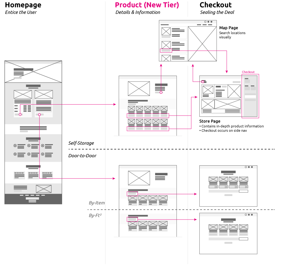
Instead of asking users to differentiate complex pricing structures upfront, they now choose between the two primary modes of service. This created a much more intuitive decision point.
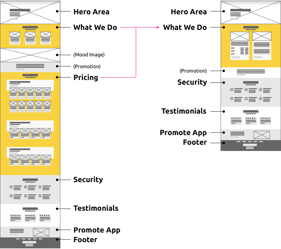
With an eye on taking Self-Service Lockers to the next level, the goal is to improve engagement by using the homepage to promote the merits of our services. Detailed pricing and information were moved further down the funnel.
Comparison of the old (left) and updated (right) homepage wireframes.

When we only offered two similar door-to-door products, comparison was straightforward and the customer journey was nearly identical (book → pickup → warehouse storage).
With the addition of self-storage lockers, the journeys diverged significantly. We therefore needed to provide richer information to help users choose the right option — without overwhelming them. The restructured flow educates visitors on the distinct benefits of each mode early, then guides them smoothly into the streamlined checkout where they can explore details, pricing, and scheduling.