Yan Yan Transportation Co.

Role

Design Lead

Product Designer

Art Director

Scope

Design Strategy

UI Design

Branding

the Challenge

Update a brand without disassociating itself from its history

Retain the elements that made the brand synonymous with moving. Improve the user experience and install a design template in order to give Yan Yan Movers a consistent brand identity.


Yan Yan
Rebrand

Updating a classic
CHALLENGE

Update a brand without disassociating itself from its history

APPROACH

Retain the elements that made the brand synonymous with moving. Improve the user experience and install a design template in order to give Yan Yan Movers a consistent brand identity.

Time for an update.

When people think of Yan Yan, they think of this classic commercial that ran in the early 80's. It still lives on on Youtube.

Time for an update.

When people think of Yan Yan, they think of this classic commercial that ran in the early 80's. It still lives on on Youtube.

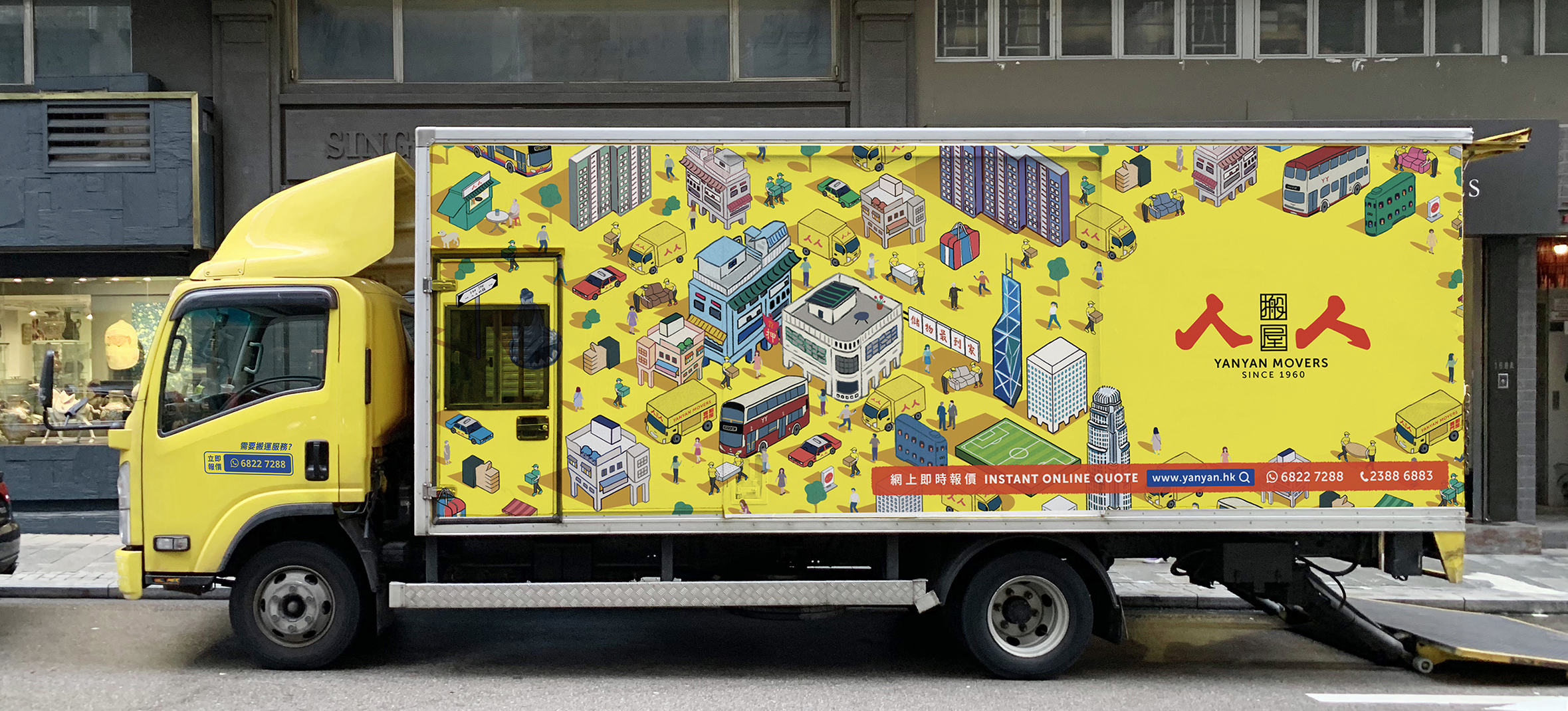
Illustrations.
Original Illustration by Sophia Ng

To modernize the brand while honoring its deep roots in Hong Kong, we developed a custom isometric illustration style that captures the city’s energetic, layered urban landscape. These hand-drawn scenes weave together familiar landmarks, bustling streets, and Yan Yan’s yellow trucks — evoking nostalgia and trust while feeling fresh and inviting.

Digital Transformation.

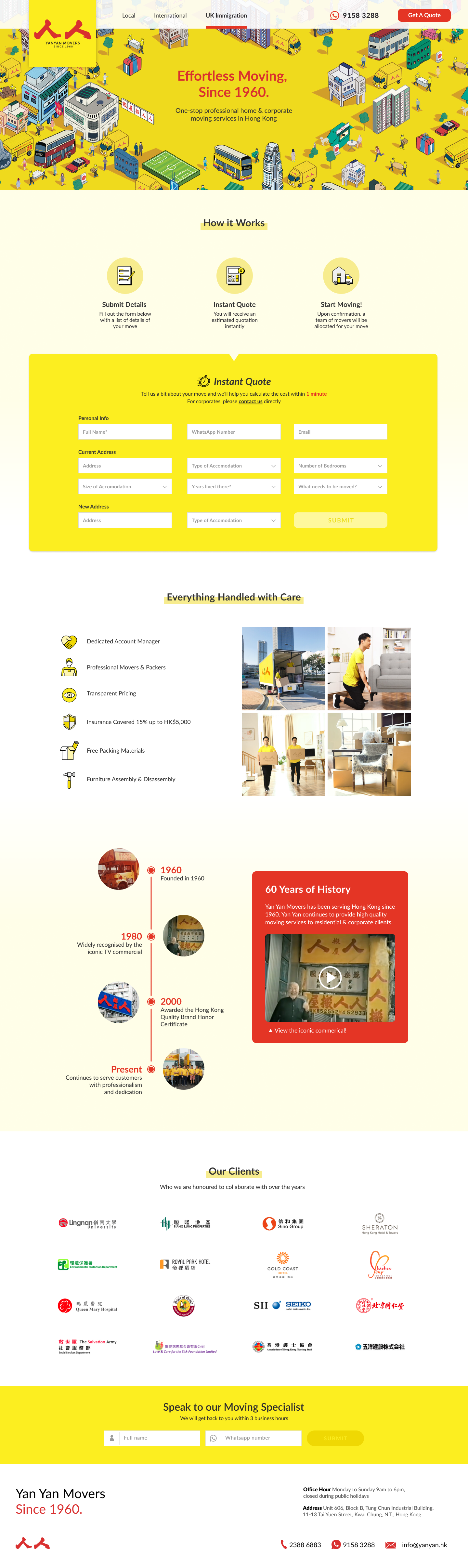
For the majority of relocation companies in Hong Kong, their website is a glorified business card that contains a telephone number that the user needs to call in order to gain any information regarding the company's services.

The original website felt dated and opaque, typical of many legacy logistics brands. To evolve Yan Yan into a modern, customer-centric service while preserving its position as a beloved Hong Kong staple, we created a responsive digital experience defined by simplicity, transparency, and trust.

International Relocation service with an anchored side form field